
This Stock Sure Does Look a Lot Like AAPL…right before it Fell 30%
We’re on bubble alert.
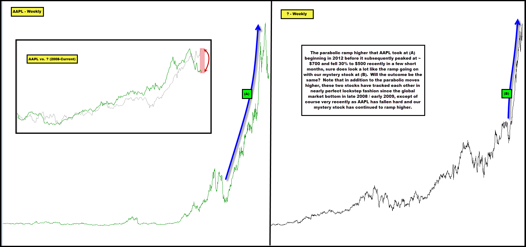
In the chart below we plot AAPL on a non-log basis over the long-term to highlight its parabolic ramp higher at (A), which began in 2012, presumably what was its “end game” move higher into an all-time “bubble” top of sorts.
We then juxtapose AAPL against a mystery stock, also on a non-log basis over the long-term to highlight its own recent parabolic ramp higher at (B).
Don’t they look incredibly similar?
Look at the inset chart which highlights how closely they’ve tracked together since the global panic bottom in late 2008 / early 2009. The moves have been in lockstep fashion, excluding the recent price action, where AAPL has quickly fallen 30% as the mystery stock has pushed higher.
We note that the mystery stock is in a completely unrelated business and industry – comically different actually.
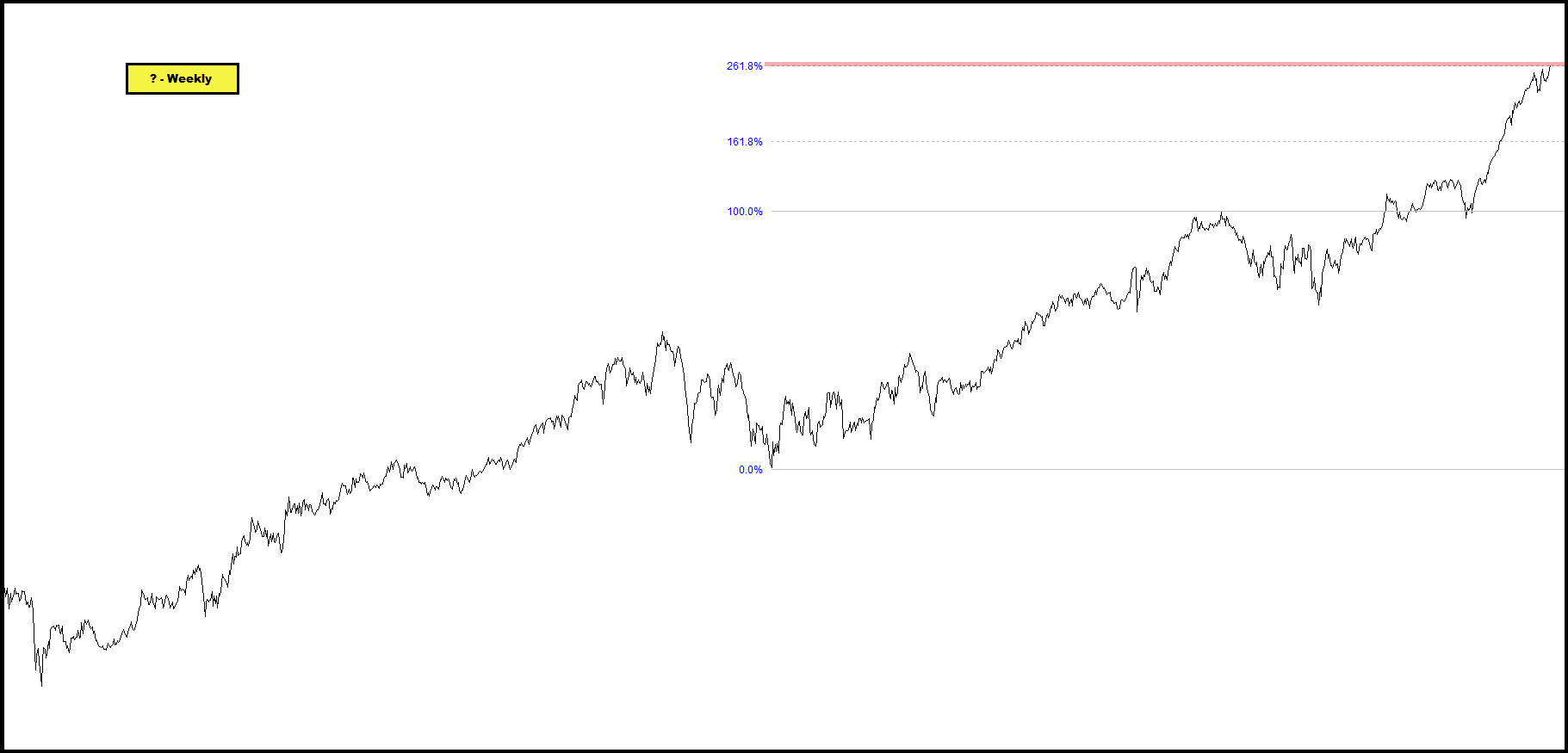
Secondly, this stock is also now trading at very noteworthy technical resistance – that being its 261.8% Fib expansion level in the chart below.
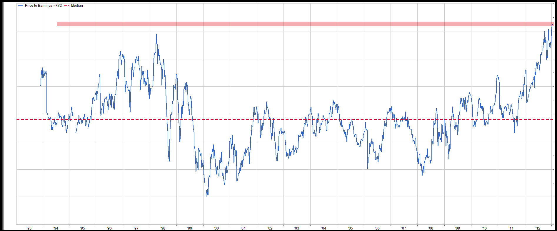
Lastly, though this is hardly a site dedicated to fundamental valuation, note the stock’s forward P/E on FY earnings two years out – in extreme territory vs. the historical median.
What stock is this? Will its fate be similar to AAPL’s recent fate?
Comments are closed, but trackbacks and pingbacks are open.