Repeating Pattern in the Ratio of Copper vs. Gold Suggesting Another Fall 2008 Scenario?
We’ve commented on the ratio of copper vs. gold a few times over the past few months including here and here.
The ratio tends to be a good proxy for global economic activity and risk levels.
Prior posts have centered around the absolute value of the ratio of copper vs. gold, which, excluding a few notable exceptions over the past 30 years, is currently very low by historical standards.
This post shifts its focus toward what appears to be a repeating pattern in the ratio (and for those that don’t believe in the value of chart patterns or their repeating nature, we direct you to this recent post as but one example of why this is misguided).
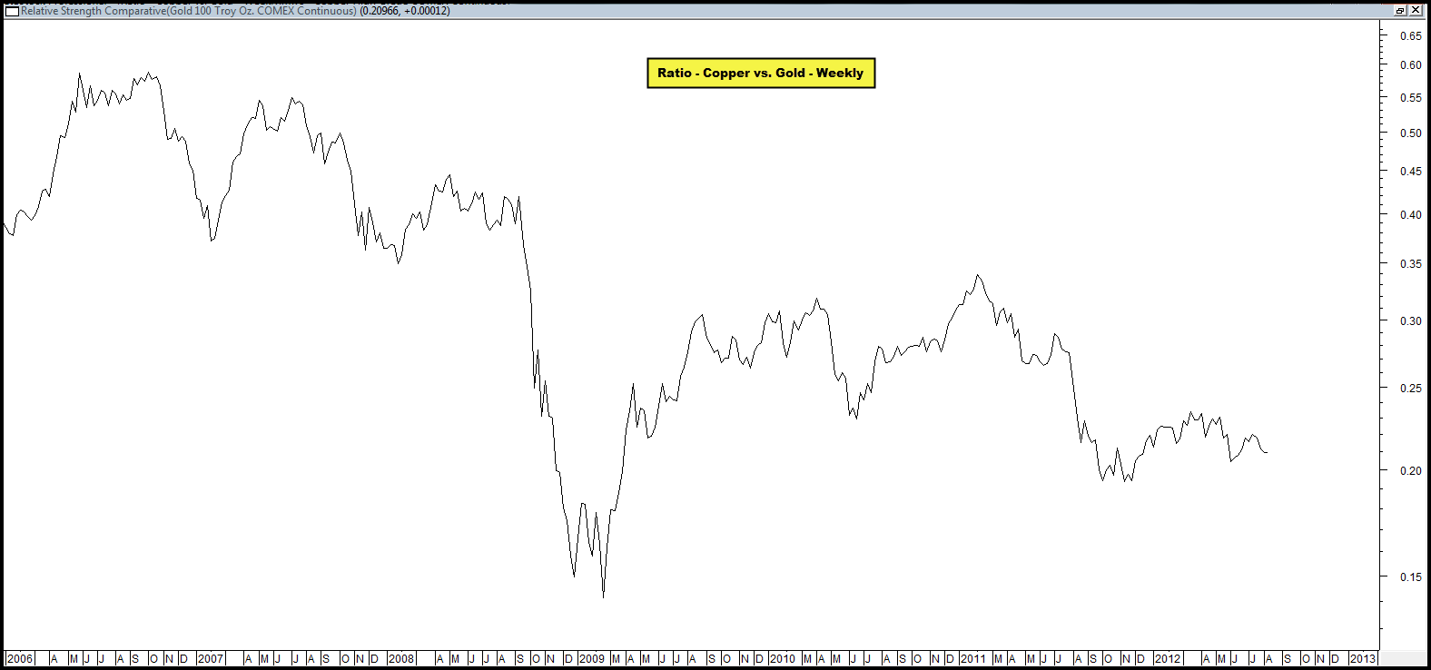
The first chart below is unadulterated and not annotated.
It plots the ratio of copper vs. gold since 2006 until now. We simply want you to look at it with your own eye without our commentary and ask yourselves what you see.
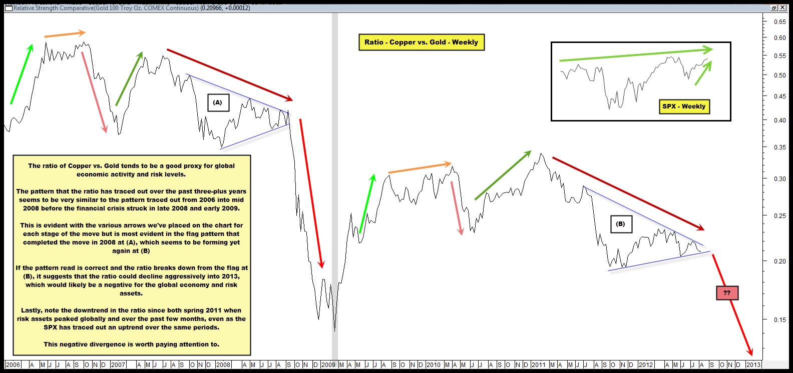
We now present the same chart above with annotations. Can you see any repeating patterns?
The pattern that the ratio has traced out over the past three-plus years seems to be very similar to the pattern traced out from 2006 into mid 2008 before the financial crisis struck in late 2008 and early 2009.
This is evident with the various arrows we’ve placed on the chart for each stage of the move but is most evident in the flag pattern that completed the move in 2008 at (A), which seems to be forming yet again at (B).
If the pattern read is correct and the ratio breaks down from the flag at (B), it suggests that the ratio could decline aggressively into 2013, which would likely be a negative for the global economy and risk assets.
Also, note the down-trend in the ratio since both spring 2011 when risk assets peaked globally and over the past few months, even as the SPX has traced out an up-trend of its own over the same periods.
This negative divergence is worth paying attention to.
Lastly, we are NOT attempting to use this ratio to suggest another panic/crisis is in front of us or likely.
What we are suggesting is that if the ratio remains a good proxy for global economic activity and should the pattern play out like it did in 2008, it could portend material declines in the prices of risk assets in general in coming months.


Comments are closed, but trackbacks and pingbacks are open.